20th Anniversary Logo Design Competition Screening Results
Best Design Logo Award
| Name | JEARANAIKULKANOK Kunramanya |
| Works |
 |
| Description |
|
2nd Awards
| Name | KIM bosunga | ||
| Works |
|
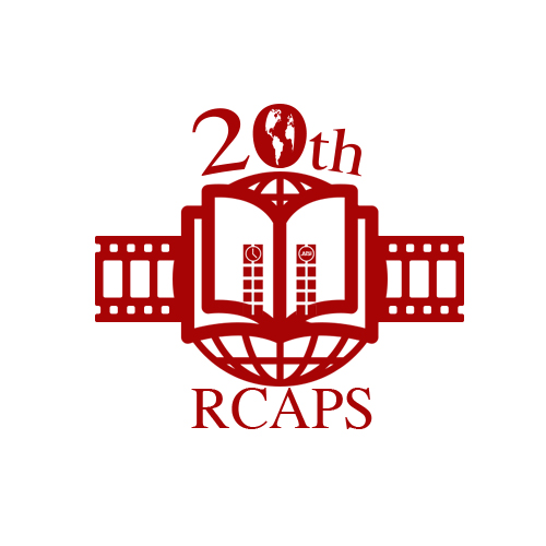
Description | At first, in this logo, I want to describe RCAPS’s whole history from the past to the future. That’s why I put the movie clip in the logo. Universally, “your life is like a movie!” means “your life is quite interesting”. Now I hope RCAPS will become more popular and a top organization in the university. Be like a “successful movie story!” from the past to the future is what I want to describe. Second is about RCAPS’s identity. RCAPS does a lot of things related to research or communication. For example, research meetings and international symposiums. It’s the main work of RCAPS, so I put in the middle of the logo APU’s identity, the clock tower. Behind the book is Earth. It signifies communication with the world through RCAPS. And also it signifies the way to go to the future. Finally, I want to explain the empty book. There’s no words. RCAPS has quite a long history. Maybe there were many problems, or bad things. But we can’t write down again about our past. So the empty book means, “we can write a better story from now on, do RCAPS’ best!” |
| Name | SUDA Hayato | ||
| Works |

|
Description | I want to describe RCAPS 20th Anniversary Logo. The blue line expresses the deep-surging wind in Asia Pacific Studies education, and the windmill symbolizes RCAPS as a wheel in a center of wave. As long as there is the wind, it wheels and develops sustainably. Eventually it generates a new wind (education). |
Thank you for the many design applications.
The winning logo will be used widely in the Asia Pacific (AP) Conference, events, publications, and the web site of RCAPS.