

CIL Logo Design Selected
In August 2019, the CIL Logo Design Competition was held, and the winning entry was submitted by Associate Professor JUNG Jonghee of the APU Center for Language Education.
Associate Professor JUNG's design was officially adopted as the CIL logo and now serves as the official symbol of the Center.
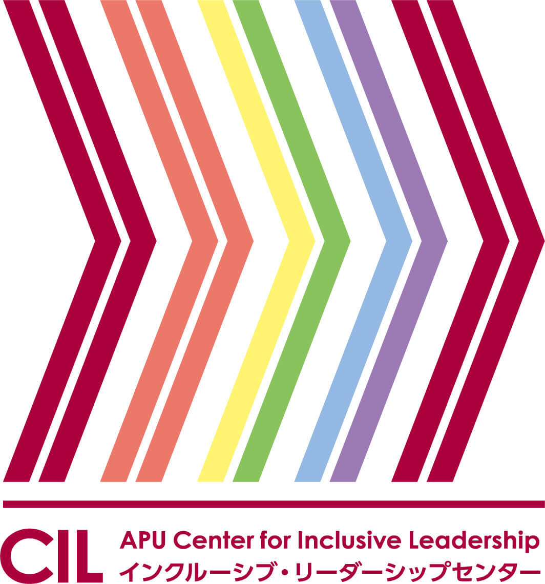
THE COLORS
Drawing inspiration from the Japanese saying “Jyu-nin to-iro” (⼗⼈⼗⾊), literally meaning “10 people 10 colors”, the logo features 10 so-called “feathers” colored differently. These colorful feathers represent diversity, one of the core values of CIL and APU.
THE ARROW
These 10 feathers form an arrow, reflecting the determination and power to fly forward. With all our “colors” (uniqueness and differences), we will create powerful synergy, strength and progressive momentum to move forward when we coexist and cooperate with each other.
